Paper Editorial
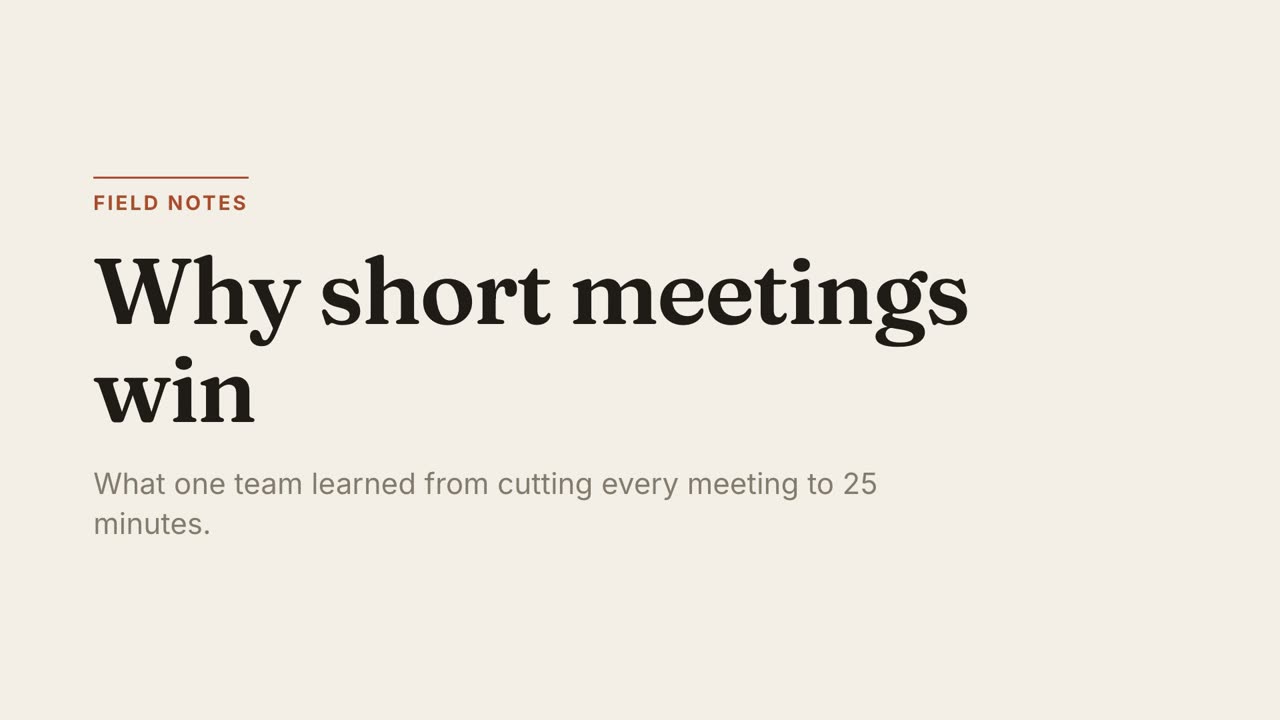
Essays, explainers, thought piecesWarm paper, a serif headline and one rust accent. Unhurried, like a magazine feature.
A style is a spec, not a locked file. Your agent reads it and builds scenes that follow it, so the same look works for any document.
Best for: Essays, explainers, thought pieces. Warm paper, a serif headline and one rust accent. Unhurried, like a magazine feature.
Layout: Wide left margin, headline top-left, a thin rule above section labels. Bars are flat blocks.
Motion: Slow rises of 28px with a fade, 0.8s, power2.out. One element moves at a time. No bounce.
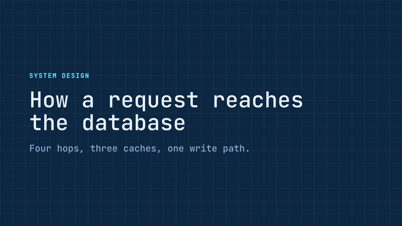
Best for: Architecture, systems, technical walkthroughs. Deep navy grid with cyan linework. Everything is drawn as an outline and wipes on like a plotter.
Layout: Faint 60px grid on the backdrop. Boxes and bars are outlines, never fills. Labels are small uppercase mono.
Motion: Left-to-right wipes (clip-path), 0.9s, power1.inOut. Labels follow their shape. Nothing fades or bounces.
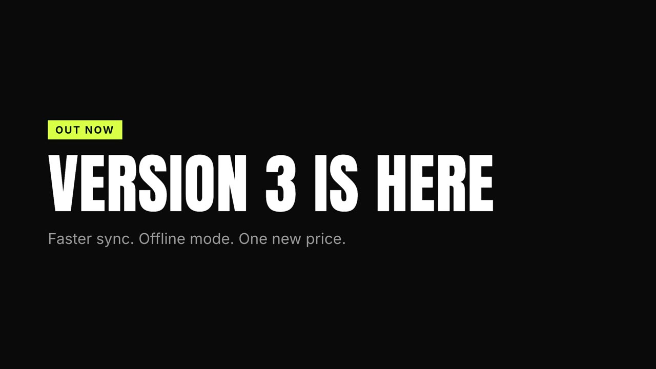
Best for: Launches, promos, social cuts. Black stage, condensed type at poster scale and one acid colour. Words land hard and fast.
Layout: Uppercase condensed headlines fill the frame with tight leading. One idea per scene.
Motion: Hard cuts: elements snap in from 118% scale in 0.32s, expo.out, 0.07s apart. Nothing drifts.
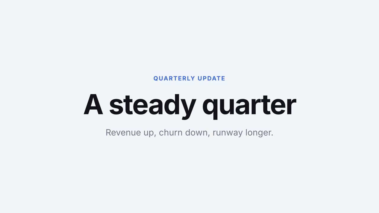
Best for: Product stories, investor updates. A pale stage, generous space and calm numbers on white cards. One figure owns each frame.
Layout: Centered. White cards with a soft shadow. Twelve words or fewer per scene.
Motion: Soft scale from 92% to 100% with a fade, 0.7s, power3.out. Numbers count up over 1.2s.
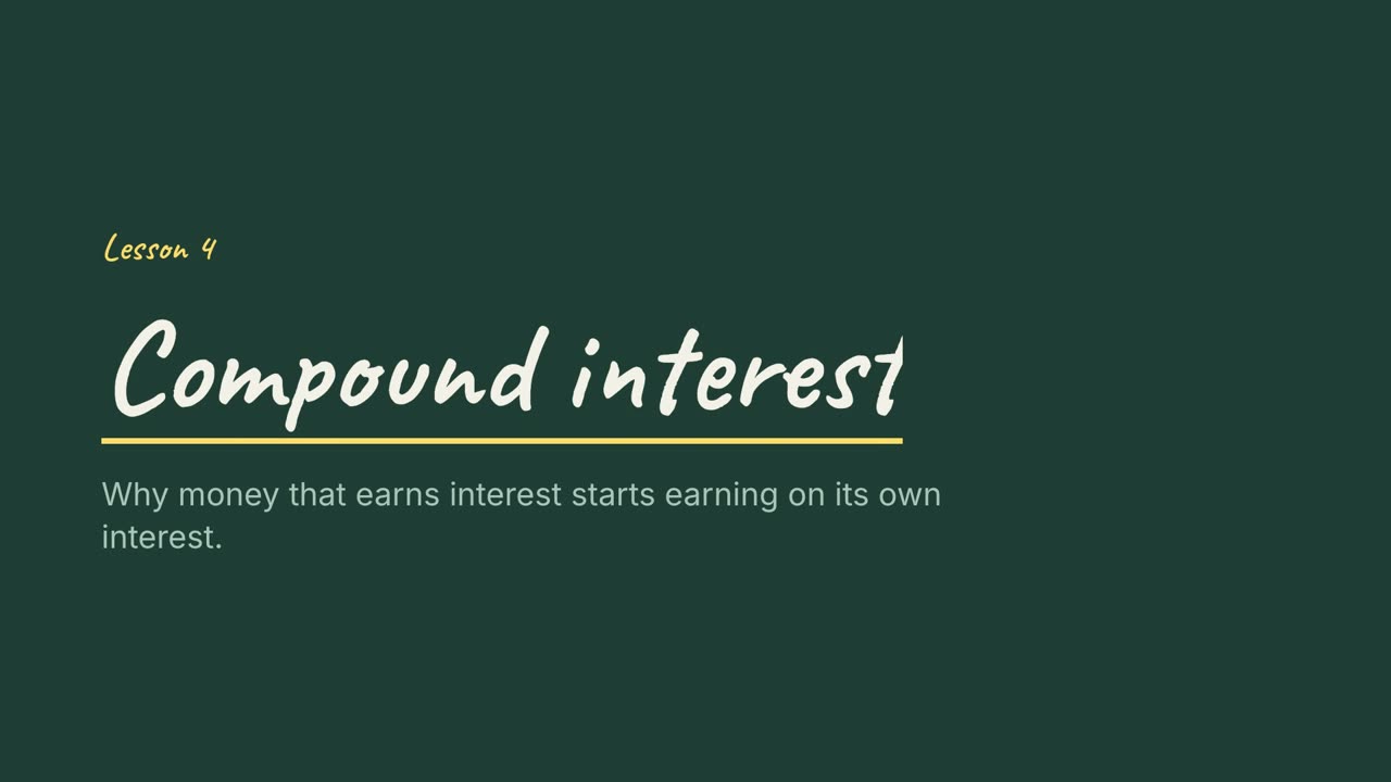
Best for: Teaching, tutorials, course modules. A green board with handwritten headings and a yellow highlight. Steps are written out one by one.
Layout: Handwritten headings, numbered steps down the left. The key term gets a yellow underline.
Motion: Left-to-right wipes as if written, 0.7s, power1.out, with a 0.22s gap between lines.
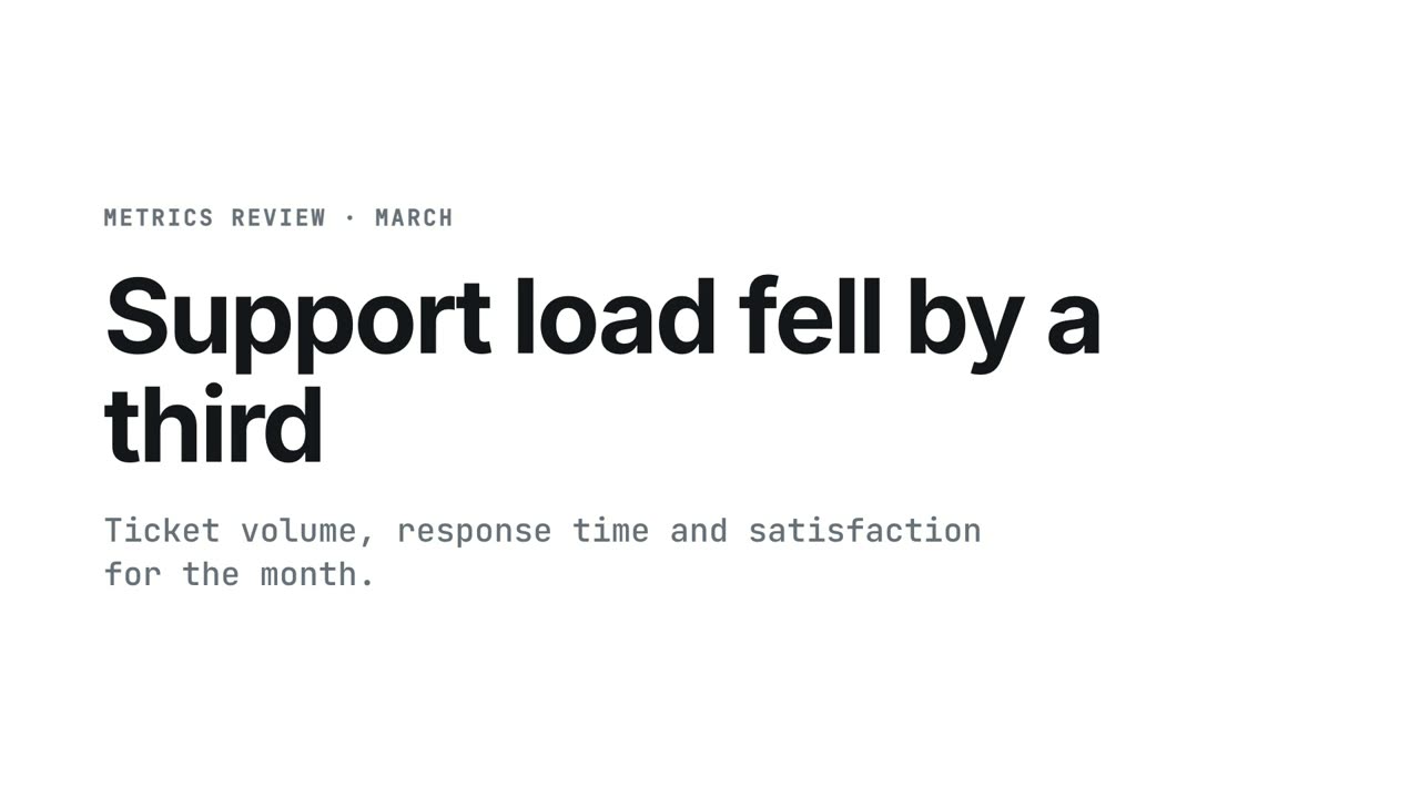
Best for: Reports, metrics reviews, finance. White page, mono figures and a single green for growth. Built so charts stay readable.
Layout: A thin rule under every heading. Figures in mono. No gradients, no shadows, no 3D.
Motion: Quick 16px rises, 0.45s, power2.out, 0.08s apart. Bars grow from the baseline; labels follow.
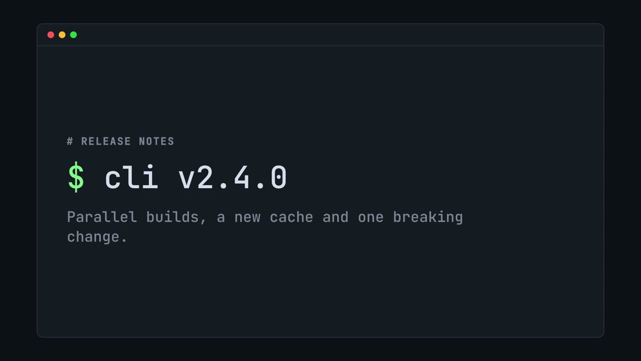
Best for: Dev tools, changelogs, CLI demos. A charcoal terminal window in mono with a green prompt. Lines print in steps, like real output.
Layout: Everything sits inside one window with a title bar. Headings start with a prompt. Accent marks the changed line.
Motion: Stepped wipes that read like typing: 16 steps over 0.6s, 0.2s between lines. No easing curves.
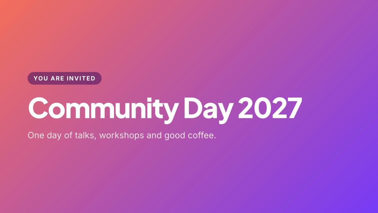
Best for: Brand reels, announcements, event openers. A coral-to-violet wash with rounded white type. Friendly and bright, with a springy entrance.
Layout: Gradient on a full-bleed child. Labels are pills. Bars and steps are translucent white with large radii.
Motion: Springy pops from 86% scale, 0.55s, back.out(1.6), 0.09s apart. The background never moves.
One command, then hand your agent a document.